本周小作文预测新鲜出炉?可参考日期:10月4日-10月10日
1. 题目和图片
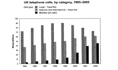
The chart below shows the total number of minutes (in billions) of telephone calls in the UK, divided into three categories, from 1995-2002.Summarise the information by selecting and reporting the main features, and make comparisons where relevant.
2. 思路提纲
3. 高分范文示例
The bar graph compares disparate types of calls in terms of the total minutes spent on
them by individuals in the United Kingdom over eight consecutive years.
Generally, despite the fluctuation, the figure for local calls remained the most
considerable, whilst the level of mobile calls was still the least, although it
experienced the most significant degree of ascent.
Specifically, the number of minutes of local fixed line calls was slightly above 70
billion in 1995. Nonetheless, following a consistent rise to its peak of almost 90
billion in 1999, a reduction occurred, and by 2002, it arrived back to similar the initial
level.
On the other hand, the other two categories of calls saw a similar growth. The figure
for national and international fixed lines started at below 40 billion minutes before it
experienced a modest uptrend to marginally more than 60 billion minutes in 2002. As
for mobile calls, after having a moderate increment in the number between 1995 and
1999 from roughly 4 billion minutes, it soared in the last three years, ending at 40
billion minutes or thereabouts
4. 高分词汇或表达
(1) Disparate 不同的
(2) Consecutive 连续的
(3) The most considerable 最为重要的
(4) Degree of ascent 上升程度
(5) Specifically 具体地
(6) Reduction 减少
(7) Whilst 而
(8) Following a consistent rise to its peak 随即是持续上升到峰值
(9) Arrived back 回到
(10) Modest uptrend 适度上升趋势
(11) Moderate increment 适度增加
(12) Or thereabouts 大约在
(13) Similar to the initial level 与初始水平相似
1、题目和图片
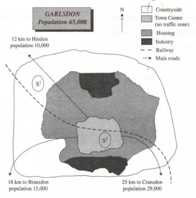
The map below is of the town of Garlsdon. A new supermarket (S) is planned for the town. The map shows two possible sites for the supermarket.
Summarize the information by selecting and reporting the main features, and make comparisons where relevant. Write at least 150 words.
2、思路提纲
3、高分范文示例
Illustrated in the map are the likely locations of a new supermarket in Garlsdon, a
town with a populace of 65,000.
It could be easily seen that the first possible site (S1) is situated in the countryside, the
northwest of the area, and between the railway and the main road leading to Hindon
with 10,000 residents. It is also near some sections of the housing region and the
industries in the north. The concern about this location is that it is distant from the
other neighboring towns.
On the other hand, the second probable placement (S2) is in the southern part of the
town center, encircled by the residences and in the vicinity of the industrial region.
While it is also within reach of the railroad line, it is in a place where driving is
restricted. Meanwhile, the main roads are directed to the adjacent places, like
Cransdon (population of 29,000) and Bransdon, having inhabitants of 15,000, ending
at the boundary of the center.
Generally, in terms of convenience in transportation, S1 is a better option, but
considering the number of possible customers, S2 is a good place for the new
supermarket.
4、高分词汇或表达
1. Likely可能
2. Populace民众
3. Concern关注
4. Distant远
5. Probable placement可能的放置
6. Encircled包围
7. Vicinity附近
8. Restricted限制
9. Adjacent邻近的
10. Inhabitants居民
11. Boundary边界
12. Considering考虑到
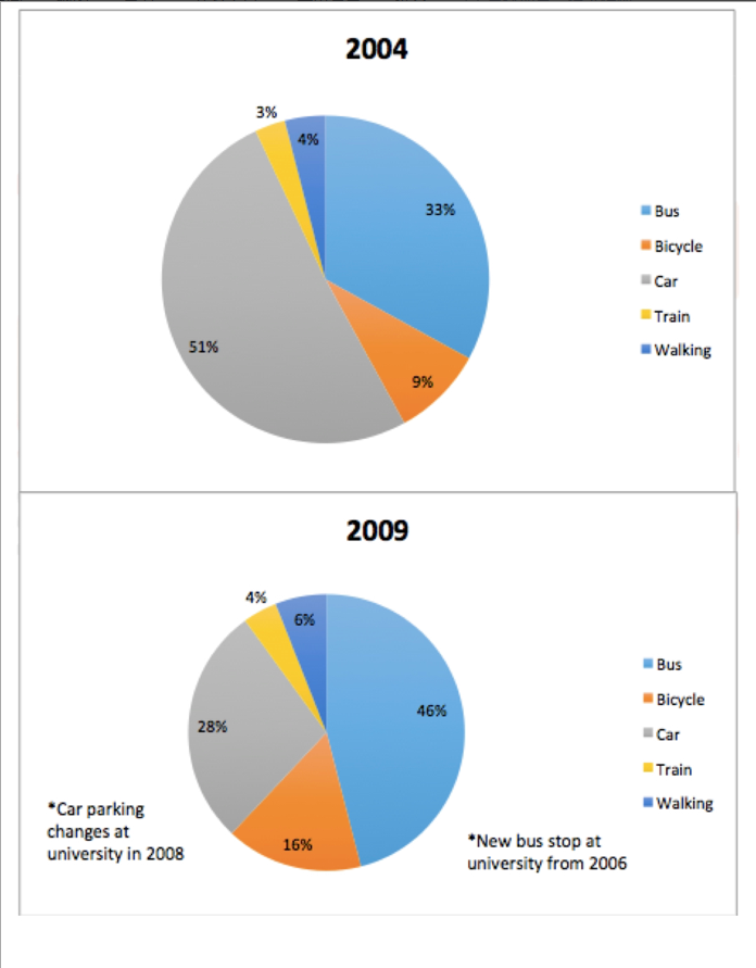
1. 题目和图片
The following pie charts show the main modes of transportation people used to travel
to university for work or study in 2004 and 2009. Please judge and select the key
information in the chart and summarize it. If the information is related, please make
the necessary comparison. You should write at least 150 words.
2. 思路提纲
3. 高分范文示例
The pie charts compare the disparate means of transport for individuals going to a
university for work or learning purposes spanning half a decade.
Generally, the primary mode of traveling to the aforementioned destination differed,
with it being cars in 2004 and buses in 2009, and the change could be attributed to
the car park changes in 2008 and a new bus stop two years prior to that. On the
contrary, trains remained the least utilized method of transportation.
To be specific, roughly half of the people proceeding to the campus drove cars in
2004, but the figure drastically lessened to merely 28% in 2009. By contrast, there
was a noticeable uptrend amounting to 13% in the share of those using buses to 46%.
Concerning the data of train users, it had a trivial growth to 4%.
In addition to previously stated means, riding a bicycle and walking to the university
were also done by workers and students. The percentages of both became more
sizeable, with the former experiencing a comparatively greater level of increment to
16%, whilst the latter ascended marginally from 4%.
4. 高分词汇或表达
(1) Disparate不同
(2) Spanning生成
(3) Aforementioned上述的
(4) Attributed由于
(5) Prior事先
(6) Campus校园
(7) Lessened减轻
(8) Uptrend趋势
(9) trivial琐碎
(10) More sizeable更可观
(11) Comparatively比较
(12) Increment增加